A monochrome look is an entire outfit built within one color family — and it works when the shades vary slightly and the textures vary a lot. The formula, visible in collections from Valentino's all-pink PP collection of 2022 to the tonal beige runs at Max Mara through 2024 and 2025, is simple to state and exacting to execute: one hue, several depths of it, at least three distinct surfaces. Done well, monochrome lengthens the silhouette and reads as deliberate polish. Done carelessly, it reads as a uniform. The difference is method.
Why does dressing in one color look expensive?
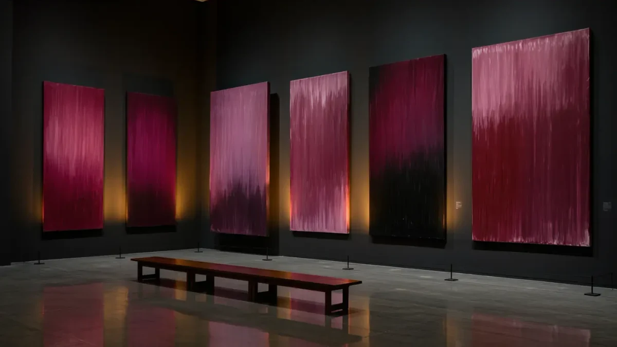
Because tone-on-tone dressing removes the visual interruptions that break a silhouette. When jacket, trousers and knit sit within the same color family, the eye travels up the body without stopping, and the wearer reads taller and more composed. Stylists have long used the trick for precisely this reason; the runway versions simply industrialized it, with Valentino's PP collection — 400-odd looks in shades of pink, per the house's own spring 2022 show notes — serving as the most cited modern reference.
The second reason is material honesty. Without color contrast to carry interest, fabric quality becomes the entire show. A gray look in brushed wool, smooth leather and fine merino photographs like luxury; the same gray in three identical flat cottons photographs like a delivery uniform. Monochrome does not forgive cheap fabric — it advertises it. That is not a warning against the technique but a note on its priorities: this is the look where a fabric budget outperforms a label budget.
Which colors work best for a total look?
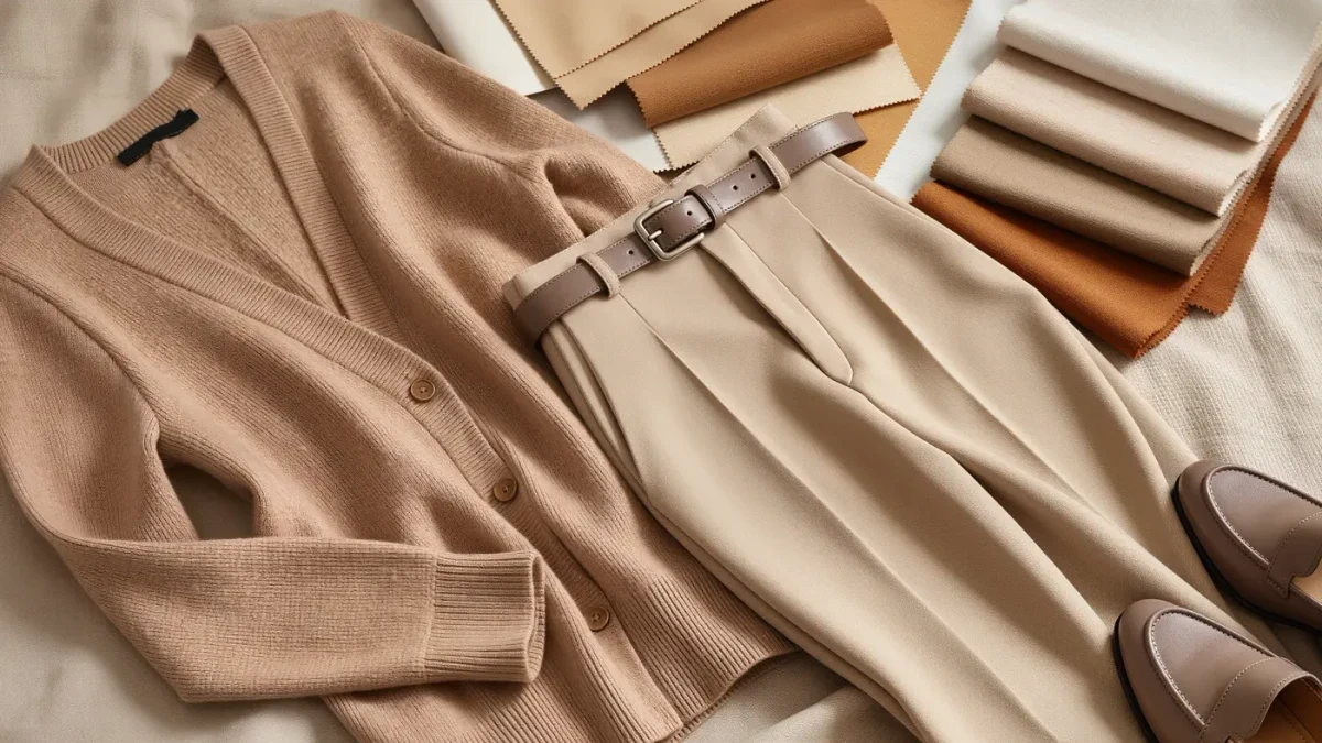
Four families carry monochrome most reliably. Neutrals — camel, beige, chocolate, ivory — are the classic register and the easiest to source, since most wardrobes already contain near-neighbors that can be nudged together. Gray rewards texture most dramatically, from charcoal flannel to pale heather knit. Navy is the quiet overachiever: head-to-toe navy reads almost black at a distance but softer up close. And saturated monochrome — red, green, pink — is the maximalist version, best attempted once the neutral version feels natural.
Black is the tempting exception and the trickiest. All-black is so common that it rarely reads as a deliberate monochrome choice unless the textures are sharply separated — matte wool against polished leather, heavy denim against sheer knit — and unless the blacks genuinely match. Faded black alongside fresh black is the most frequent monochrome failure in ordinary wardrobes.
White makes the opposite demand: it flattens both figure flaws and figure strengths into one bright plane, which is why stylists recommend ivory, cream and off-white mixtures instead. Tonal whites differ enough to create depth while still reading as a single idea.
How much should the shades vary?
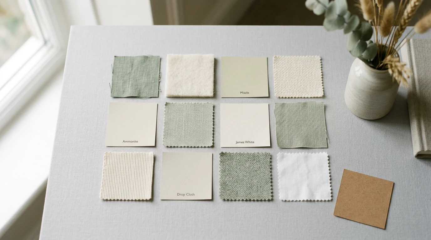
The working rule is a range of two to three tones within one family: base, lighter, darker. A camel look might combine oat, camel and dark tan. This tonal spread is what separates monochrome dressing from matching — matched sets in one flat shade tend to read as office livery, while layered depths read as styling. A practical check in front of the mirror: squint, and the outfit should still show subtle layering. If everything dissolves into one block, add the lighter or darker piece; if pieces start competing as separate colors, bring them closer.
Undertone discipline matters more than shade matching. Warm families (camel, rust, chocolate) accept each other easily; cool families (gray, navy, slate) likewise. The classic mistake is mixing a yellow-based beige with a pink-based one — each makes the other look tired. Holding candidate pieces together in daylight, an old tailor's habit, settles the question in seconds.
What role does texture play?
Texture is the engine of monochrome. With contrast by color removed, contrast by surface must do the work: knit against weave, matte against sheen, soft against structured. A beige look that combines a chunky fisherman knit, smooth leather trousers and brushed suede boots has three distinct visual voices in one color; the same three pieces in three identical flannels has none. Aim for at least three surfaces per look, and let accessories supply two of them — a grainy leather bag against fine wool, a silk scarf against brushed cotton.
Weight matters alongside surface. Layering a fine knit under a heavier coat, with mid-weight trousers below, produces the graduated density that makes tonal dressing photograph so well. This is why monochrome looks peak in autumn and winter, when layering is natural — and why summer versions lean on linen's wrinkles and raw hems to supply the missing texture.
How do proportions work in a single-color outfit?
Because color no longer divides the body, volume has to. The most reliable shapes are long-line over slim, or oversized top with a tapered bottom — one exaggerated proportion per look, anchored by the other. A column of color under an open coat is the canonical formula: it reads as one uninterrupted line, then adds structure at the frame. Belts, half-tucks and cropped hems all regain their old importance in monochrome, because they are the only remaining tools for marking the waist.
| Color family | Difficulty | Best textures to combine |
|---|---|---|
| Camel and beige | Low | Wool knit, suede, smooth leather |
| Gray | Low | Flannel, merino, brushed cotton |
| Navy | Medium | Heavy wool, denim, ribbed knit |
| White and ivory | Medium | Linen, slub cotton, boucle |
| Saturated hues | High | Silk, fine gauge knit, crepe |
Can monochrome work in a small wardrobe?
It is, in fact, the small wardrobe's best trick. A single-color family concentrates purchasing: every new piece in the family automatically works with everything already owned, which is why tonal dressing and capsule logic travel together. Start with what the wardrobe already repeats — most people own more of one family than they think — then fill the tonal gaps deliberately: the darker layer, the lighter base, the textural accent.
What is the one mistake to avoid?
Matching everything. The verdict from a decade of tonal runways is consistent: identical shades flatten, varied ones flatter. Monochrome is a color story, not a single note — vary the depth, multiply the textures, and the one-color look becomes the most composed thing in the wardrobe.